I wrote (at length) awhile back on why I strongly believe that Windows live tiles belong on the desktop, not the Start Menu.
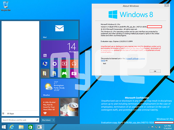
A recent article by The Verge shows that the horrible Frankenstein's monster that is the Windows 9 Start Menu has largely remained unchanged.
I desperately want the Start Menu to return, but not like this.

Alleged Leaked screenshot of a Windows 9 build
The Windows Start Menu is supposed to be light, fast, and productive. Putting the tiles into the Start Menu only exaserbates the already serious problem of Windows 8's split personality. But now instead of only occasionally dealing with the nonsensical babbling and mood-swings, you're going to have the interface constantly convulsing and speaking in tongues.
The good people at Microsoft got confused because on the phone it made more sense to have a "home screen" instead of a "start menu". So they called it the "start screen", something familiar to users (but only by name). When they brought it over to the desktop they kept the monicker "start screen", and did away with that "archaic" start menu from Windows 7, thinking that they had found the next evolution of the menu.
After tons of backlash, Microsoft realized that wasn't the case. However, instead of realizing that Metro Tiles are not an evolution of the Start Menu, they continued to follow the flawed reasoning that just because they had included the word "start" in the "start screen" title that it meant that the start screen and the start menu were related. They are not related.
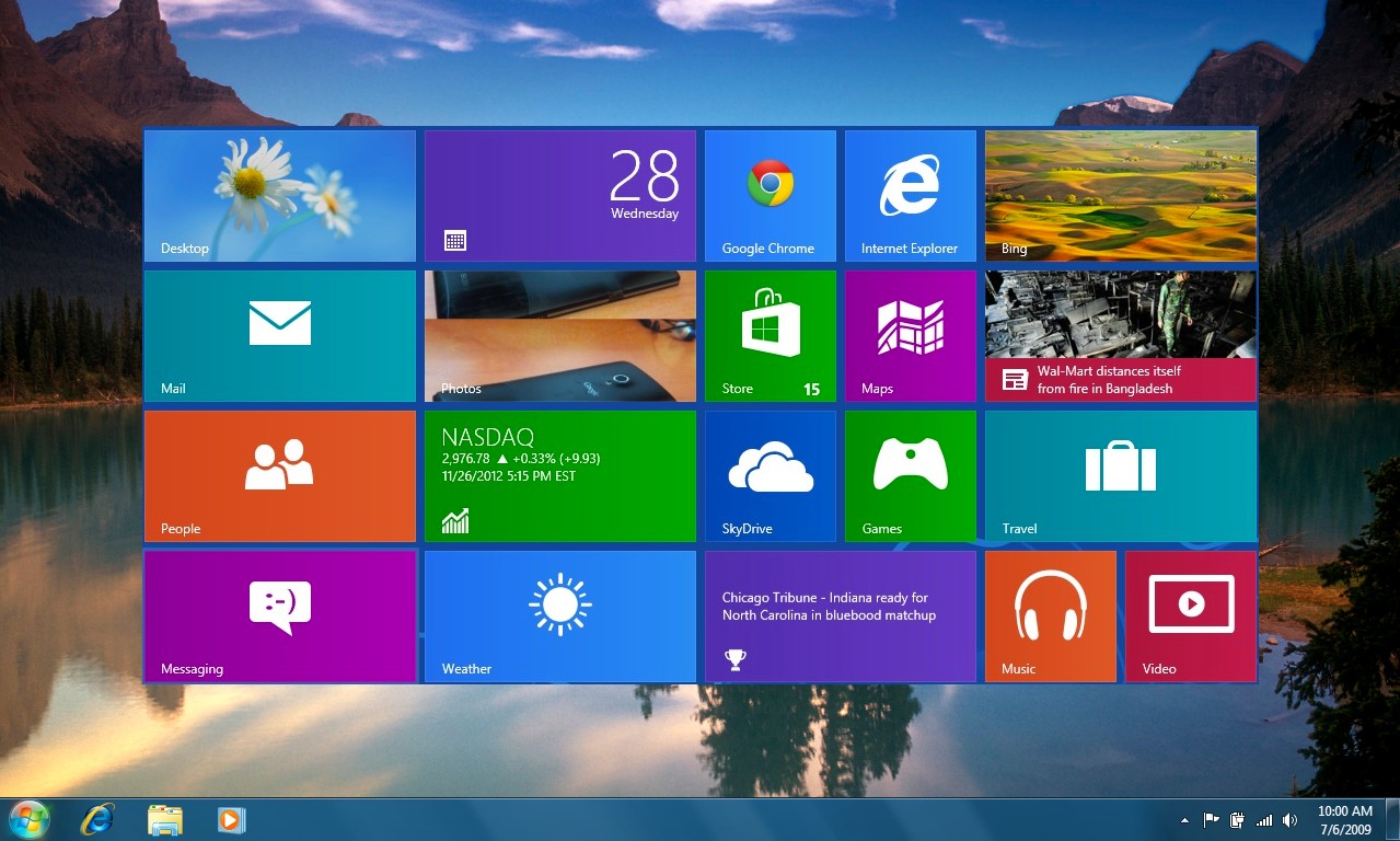
I had taken some time to mockup what Live Tiles would like on the desktop where they belong. I think it works really well. (Even just being a rough approximation!)

Please Microsoft, for all that is good in the world, don't do this to the Start Menu. You're already struggling to even keep up. If you keep on like this, you're going to have another flop.
Via The Verge