Two weeks ago I was working on a presentation for a design meeting at work and Windows 8 ended up creeping in. In taking a closer look at what the new Start screen actually did I realized something. The new "Start" screen wasn't actually a start screen at all. It was a replacement for the classic desktop.
What is the Start Menu, really?
The classic start menu is unobtrusive, universally and quickly accessible, and acts as a hub whereby you can access everything else in the system. The classic desktop on the other hand has shortcuts and widgets which maintain a consistent layout and arrangement. It serves as a backdrop and maintains context for other applications.
The new "Start" screen? It is made up of "live tiles" which are really just shortcuts and widgets combined. It maintains a consistent layout and arrangement. It also provides context for other applications, though it does so poorly.
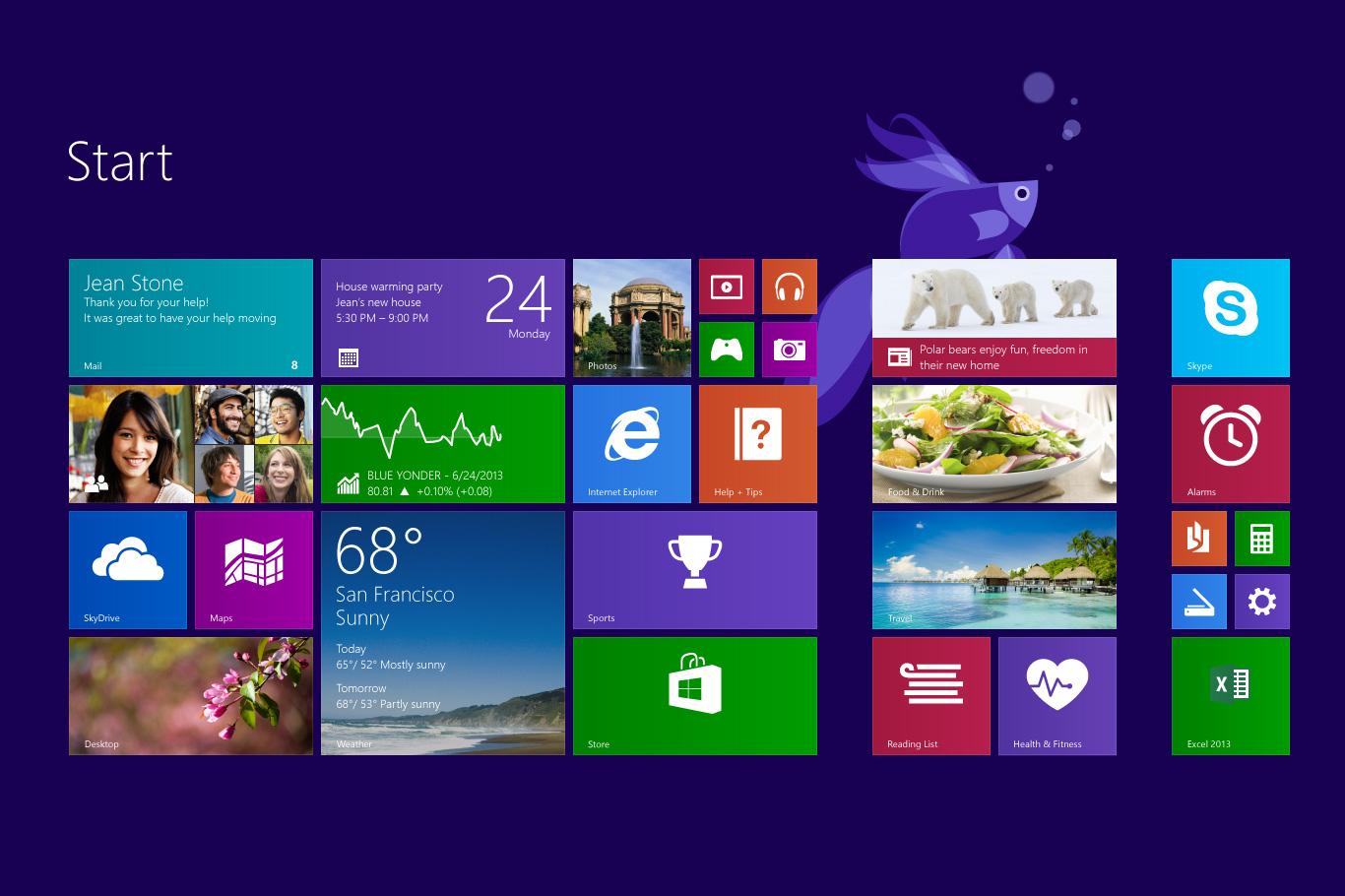
There is almost nothing about the new start screen that makes it like the start menu. It is full screen so it is no more universally accessible than anything else. It is most certainly not modular. It is highly obtrusive, and not quick by any means. The only thing really marking it at all as a start screen is that it acts as a hub. But even that is poorly conceived. Nowhere on the screen is it even discoverable that you can search.
Microsoft just announced that it is bringing the start menu back in an update to Windows 8.1 this year. That's fantastic. They've decided to stitch the live tiles onto the classic start menu in a design that looks more hobbled together than Windows 8 originally did.
Don't get me wrong. I think that the Live Tiles are a great idea. I think they look great and have some great functionality. But I don't think they belong in the start menu at all. They belong on the desktop.
The start menu is not where I go to get updates on things. It is not where I go to check the weather. Its where I go to quickly open an app, search for a file, or perform a quick and common function like shutting down the computer. Get in, get out, move on. I love the start menu. Its probably one of the things on my computer I use the most. But I spend very little time there each time I use it.
That's a good thing though. Its serving its purpose, and its serving it well. By slapping the live tiles onto the start menu, this changes things quite a bit. More than anything else it causes some pretty significant problems.
Problems with the new menu
The menu suffers from a few ailments. The most important one is that the start menu is supposed to be quick and unobtrusive. These tiles are more than just shortcuts. They're meant to be looked at and read. They're meant to draw your attention and hold it. But you just wanted to look up that file for work. Oh what file was that again? I got distracted. These tiles compete with the purpose of the start menu and are destined to hurt it, or at best, be ignored.
Inconsistent visual language
The left column of the start menu is a list of largely text-focused items with accompanying icons. The right is an unbalanced grid. Some tiles have detailed text, some have images, some only have icons. Some are small, some are big. Color has no meaning, yet some colors draw your eye more than others. You really have to shift gears to process these two different mediums. It seems to me that the column on the right is initially going to cause a lot of mental friction and then, because of that, we are going to ignore it. We aren't in the start menu to check the weather, we're looking for that game we just downloaded.
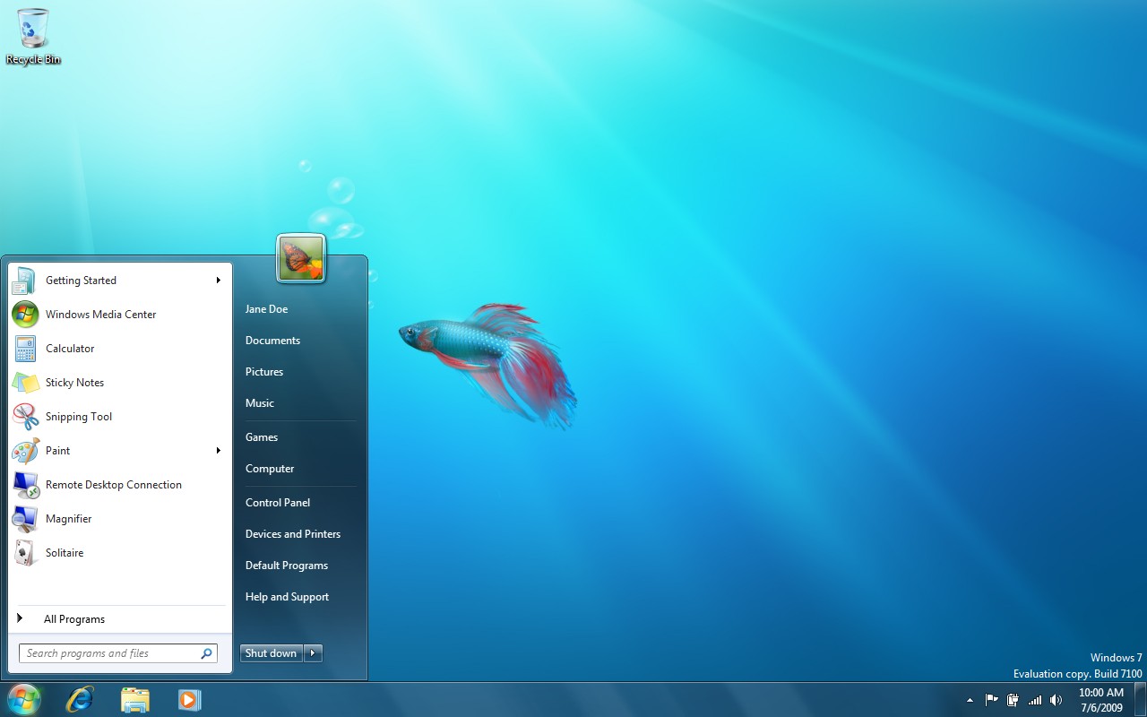
Windows 7's Start Menu:
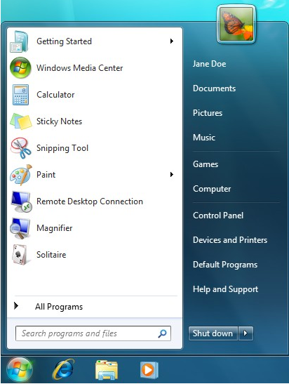
In the Windows 7 design, while the columns use different background colors, they use the same visual language. They are both by in-large text based interfaces. You can easily shift between one or the other. Thanks to the contrast between them, you aren't distracted by the other when you're focusing on the one.
Jarring design
The Windows 7 start menu is a two column structure, one on a dark backing and the other on a white. The white column grabs your attention while the dark one is un-distracting.
This new design brings us the start menu again, which is great. But its so noisy. The tiles are demanding. They have vibrant colors. They animate and switch between photos. They have inconsistent sizing and contents. Some of these problems may be inherent to the tile paradigm and may need to be solved separately. As things currently stand though, they don't fit in here.
The Desktop is due for an update
The start menu has gotten plenty of love over the years. It evolved from a maze of cascading menus to an elegant piece of UI that drives really effective and rapid control of your system. I think that the Live Tiles work beautifully on the platform they were created for: phones. I think they have a lot of potential on desktop computers too. Specifically on the desktop itself.
What kind of advancements has the desktop undergone in the past decade? Icons have become shinier, widgets were added. Not much has really changed, especially in terms of functionality. The taskbar has changed a lot. The start menu has changed a lot. But the desktop has largely stayed the same, with only one major change.
Then came Windows 8. Microsoft was trying to merge the elegant new "Metro" interface with the incrementally evolved Windows 7. What we got was a kludgy combination of two different paradigms. Not a singular Operating System.
In the Metro realm, gone were all of the familiar conventions that Windows has had for decades. No more shell. No more title bar. No close button. No taskbar. Undiscoverable "hot corners" were the only way to reveal what was running and switch between programs. There was no way to look at multiple applications at the same time.
While the Metro apps had a beautiful simplicity, they lost a lot of what made working with Windows great and efficient. The "classic desktop" view was something Microsoft was forced to hold onto because the two paradigms were so drastically different that legacy apps would all otherwise fail to function. It remained practically the same.
But it feels like Microsoft overlooked a pretty significant opportunity here. I'm ecstatic that they're bringing back the Start Menu. They absolutely should. But the Live Tiles should be moved to the desktop
Live Tiles belong on the Desktop
We've already shown that the problems live tiles were addressing were not the same ones the Start Menu was addressing. The Desktop has remained largely unchanged for years. To be honest, the live tiles are actually a big step forward for the desktop.
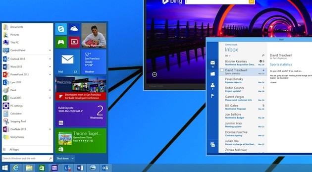
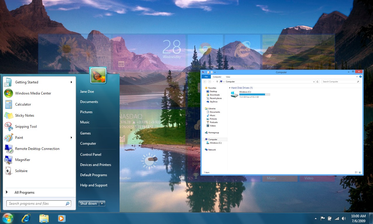
Here is a mockup I did cutting the "Start Screen" in as the desktop and the Windows 7 Start Menu on top of it:
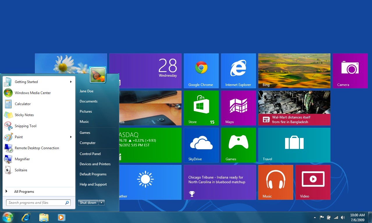
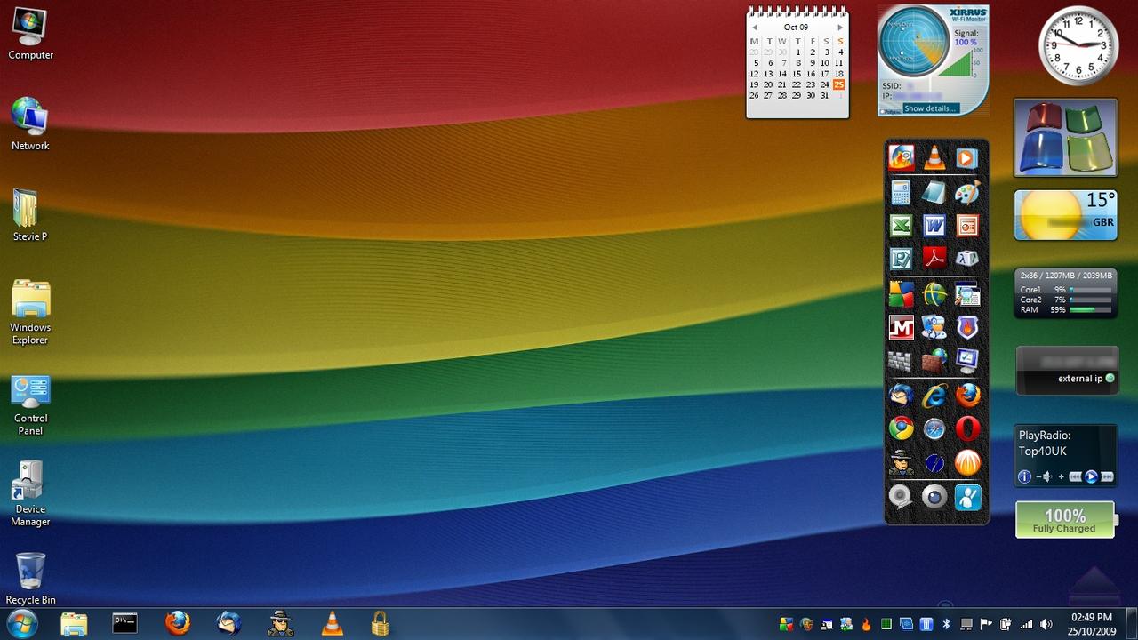
That concept is a tremendous improvement over what we currently can do with the desktop, and it retains the start menu. Here is a screen showing someone's desktop with a bunch of icons and widgets. It looks messy. Even with the demanding colors and somewhat noisy appearance of the Windows 8 tiles, they're still a huge improvement over this kind of situation:
Granted, my mockup is just a quick-and-dirty example essentially stitching the two interfaces together. We can't simply just drop the Windows 7 on top of the Windows 8 "start screen". Though I do feel it already looks significantly better than the new Windows 8 start menu.
Tiles shouldn't compete for your attention
It'd be nice to just slap the tiles on the desktop and be done with it. But its not quite that easy unfortunately. With the way tiles currently behave, they will almost completely obscure your desktop background. More importantly, they will constantly compete with what you are doing for attention.
If we move the tiles to the desktop, we move them to the place where I feel they really belong. They are an improvement to shortcuts and widgets. A pretty elegant combination of the two, actually. But as I mentioned earlier, they are loud. They demand attention wherever they can be seen. If we go back to the classic Windows paradigm of multiple windows open over the desktop, these tiles are going to be visible most of the time.
Blurring the tiles wouldn't be enough. While it would look cool and make the information on those tiles less distracting, it doesn't make the tiles themselves less distracting or less obtrusive and it doesn't help us to see the desktop background any better.
So what if they became a transparent layer of "glass" between the desktop and windows. This would solve the problems that the old desktop model had with icon clutter, as well the proposed one: distraction and noise.
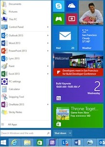
Here is a mockup I've done to demonstrate. You can see how the desktop background is still visible, and tiles are not distracting when you're working on something. You maintain context, while having everything right at your fingertips.
When no windows are open, or you just logged into your computer, clicked a tile, or you pressed that "aero peek" button on the right (to show the desktop): this is what you would see. The tiles would be fully opaque.
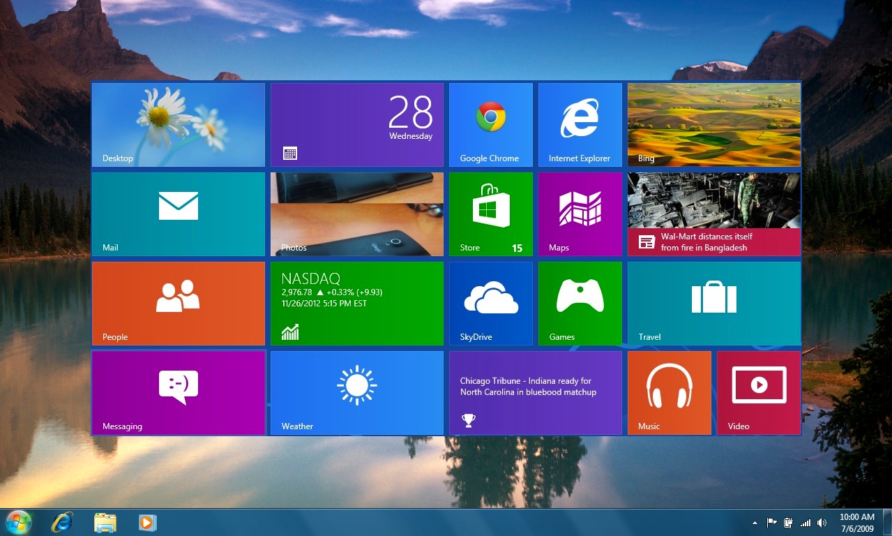
This approach would have another benefit as well. When a tile had new activity, it could temporarily become more opaque to draw the user's attention. But only when valid activity has occurred.
What I've suggested here wouldn't be the only possible way to solve those issues. Maybe its not the best way either, but I definitely feel that its a better solution than what they've put together so far.
(Note: The account name in the upper right-hand currently on the Windows 8 Start Screen is not present in my mockups. This was not ommitted because I think it should be gone. It was just faster to drop the tiles in by themselves. In fact, I do think that it makes a lot of sense to keep the account name in the upper-right hand corner. One of the jobs of the desktop is maintain context and the account widget does that well)
One Windows, not two
Microsoft has gone through a lot of trouble to try to create a consistent experience between mobile and desktop. I think they've been doing a great job, even though they've had some hiccups along the way. This update currently on its way makes a whole lot of great progress towards that goal.
Metro apps will soon be able to live on the desktop, further unifying the two worlds. This problem was so prevalent that Microsoft even packaged two versions of Internet Explorer for the OS. Some people struggle to understand that the browser is the interface that gets them onto the internet at all, let alone understand why there are two Internet Explorers on their system.
This not only benefits the user experience by not having a confusing distinction between the two paradigms, but also benefits developers. This update gets us a lot closer to developing just one application for Windows again. In a world where developers are already having to develop applications for multiple platforms and devices, having to develop two apps for the same platform was a hurdle that was probably leaving developers sore.
Windows is back on track
Its a widely held belief that Microsoft has had a fairly consistent track record of every other Windows release being subpar. Windows 98 was good, ME not, Windows XP was good, Vista not so much, 7 was good, 8 made some big mistakes. With these upcoming improvements to mouse-based input, Metro apps, and the revival of the start menu, it seems that 9 is set to continue that cycle.
I really hope that Microsoft realizes that the Live Tiles can and should have a prominent place in the Operating System, and chooses to move them out of the Start Menu and onto the Desktop where they belong.
What do you think?
Do the Live Tiles work on the Start Menu? Should they be moved to the Desktop? Would you prefer the Windows 8 "Start Screen" instead of any of this?