Windows 10: The Start Menu Returns... Sort of
Microsoft is currently presenting its new Operating System to Enterprise users at an almost embarassingly small event. They surprised everyone by announcing that the next version would not be called "Windows 9" as people familiar with counting assumed, but "Windows 10".
The number jump actually makes sense to me from a marketing standpoint. This puts Windows on par, at least by "numbering" with Mac OS X (e.g. Mac OS 10). 10 is a bigger milestone than 9, not just because its a higher number but because 10 has more significance culturally.
It could also, as it seems Microsoft is hoping, signal a bigger jump than just a regular upgrade as they've been doing.
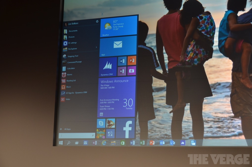
As the leaks have hinted so far, it seems that Microsoft is indeed squishing Live Tiles into the Start Menu.

I've ranted quite a bit on here about how I feel about the changes Microsoft has made to the start menu. I won't belabour that point here.
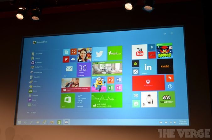
I'm kind of hopeful that Microsoft is headed in the right direction because of thier knew "Continuum" feature for touch devices:

This is very nearly what I think the desktop should be in Windows 10 across the board. Unfortunately its only that way for touch devices, but this is a step closer to the right solution.
Desktop Shortcuts need to go. Why? What do desktop shortcuts do that Tiles don't do?
They open an application. You can organize them. They have an visual representation of the app they open.
Having both only fragments the OS and muddies the model.