Microsoft Office 2016
I've (almost) always been a fan of Microsoft's Office suite. When the opinion-polarizing "ribbon" came out with Office 2007, I loved the idea. It made the interface feel more haptic and visual. There was no reason, in my opinion, to force everything to merely be textual menus.
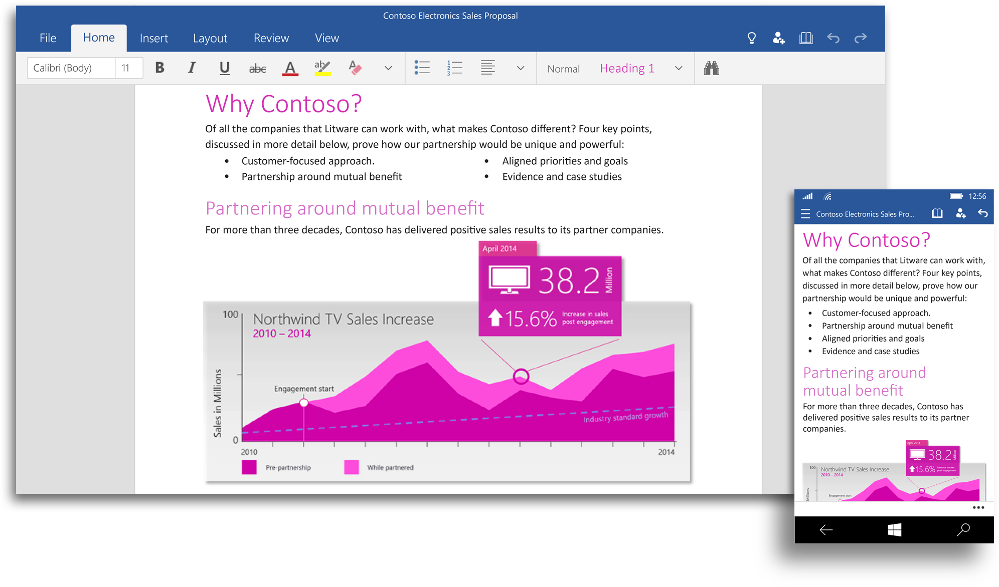
Microsoft has formally announced Office 2016 is on its way for Windows 10, and I am really impressed with Microsoft's new direction on software in general.

Microsoft had long treated other platforms with a bit of contempt. It was stuck in a more Apple way of thinking in building a walled garden and creating an isolated ecosystem. Microsoft's few forays into multi-platform technologies were few and far-between, and laced with apparent begrudging and neglect.
For example, office for Mac leaves a lot to be desired. It is frequently far behind the primary office cycle, and even the newest versions immediately felt dated and unloved. The latest version of Office for Mac is currently laden with skeumorphic blemishes and low-resolution datedness.
But things have changed. Microsoft's latest entry, 2016 is really stepping up its game. The interface looks really slick and its going to be multiplatform (iOS, Windows, and more). Current CEO Satya Nadella has been one of the biggest proponents of this new push towards a more open and inclusive Microsoft. With Internet Explorer's imminent replacement on the rise, Windows 10, and Office 2016, Microsoft seems to really be making some great changes.