The face of software has changed tremendously in the past few years. It wasn't long ago that you could open up the website for a well-known company on your smartphone and find that the site was completely unusable. Now, not only does almost every website support "mobile", but there is some incarnation of the site or a corresponding app on everything from a watch to television.
We've come a long way, and we've made some really excellent progress.

Mobile Last, Mobile First
As we adapted to this new frontier of software we adopted new ideas about "mobile" devices. These devices went from being an after-thought to first-class citizens as a result of the mobile-first movement.
The Mobile First movement had a lot of beneficial, though ancillary, effects: we had to refine our software to run faster and more efficiently. Browser developers and Hardware Manufacturers had to become a little more standards compliant and cooperative. We learned we had to prioritize better what was actually put into the software because of the limited space of smaller devices.
But along the way, we've also picked up a sort of backwards idea about devices. We sort of haphazardly lump anything other than a laptop or desktop into this catch-all of "mobile". We end up with this simplified sort of view that there are two classes of hardware: mobile and desktop. This view makes the reality easier to bear, but as it turns out, its also wrong.
It makes sense how we got here. When "mobile" first started being a serious consideration, it was a pretty limited category. Consider the first iPhone: It had a 320 x 480px resolution, barely over 100 MB of ram, and 16 GB of storage at most. Web browsing on this device was ridiculously slow, and its browser choked on even the mention of JavaScript.
Looking at the early spread of mobile devices as distinctly different and separate was the right way of thinking. Making your website work on these wasn't a matter of simply applying a few media queries- You had to write a completely separate experience.
As smartphones rapidly evolved over the next few years, developers scrambled to support them. They found themselves having to build duplicate versions of their websites from scratch because not only could they not simply cram the existing site down to the smaller form factor, but the existing site was built only for the standards-derelict and then-dominant Internet Explorer and had to be retooled to support these new diluted mobile browsers.
After awhile, developers made a logical conclusion: Mobile First. Now these low-powered devices would form the lowest-common denominator for their software. If their design and code worked on mobile devices, it would work everywhere. This shift made a lot of sense and brought about a wave of minimalistic changes to the web.
This attitude change has done a lot of good, though the mindset is not without serious drawbacks (which I'll touch on in a later article). But as we've attached ourselves more strongly to the mobile-first movement we haven't seemed to notice that "mobile" has disappeared.
Mobile is gone
Mobile is no more. Of course there are still smartphones. And those are definitely mobile, as in, can easily be carried with you. But the term mobile, as in, the category of all handheld devices, no longer holds much value.
Still skeptical? Let's consider what mobile was:
- Portable
- Lower power
- Usually touchable
- Small screen
Now let's take a look at some devices that have been released within the past 2 years. Which of these fall in the category of "low powered portable devices with small touch screens?"
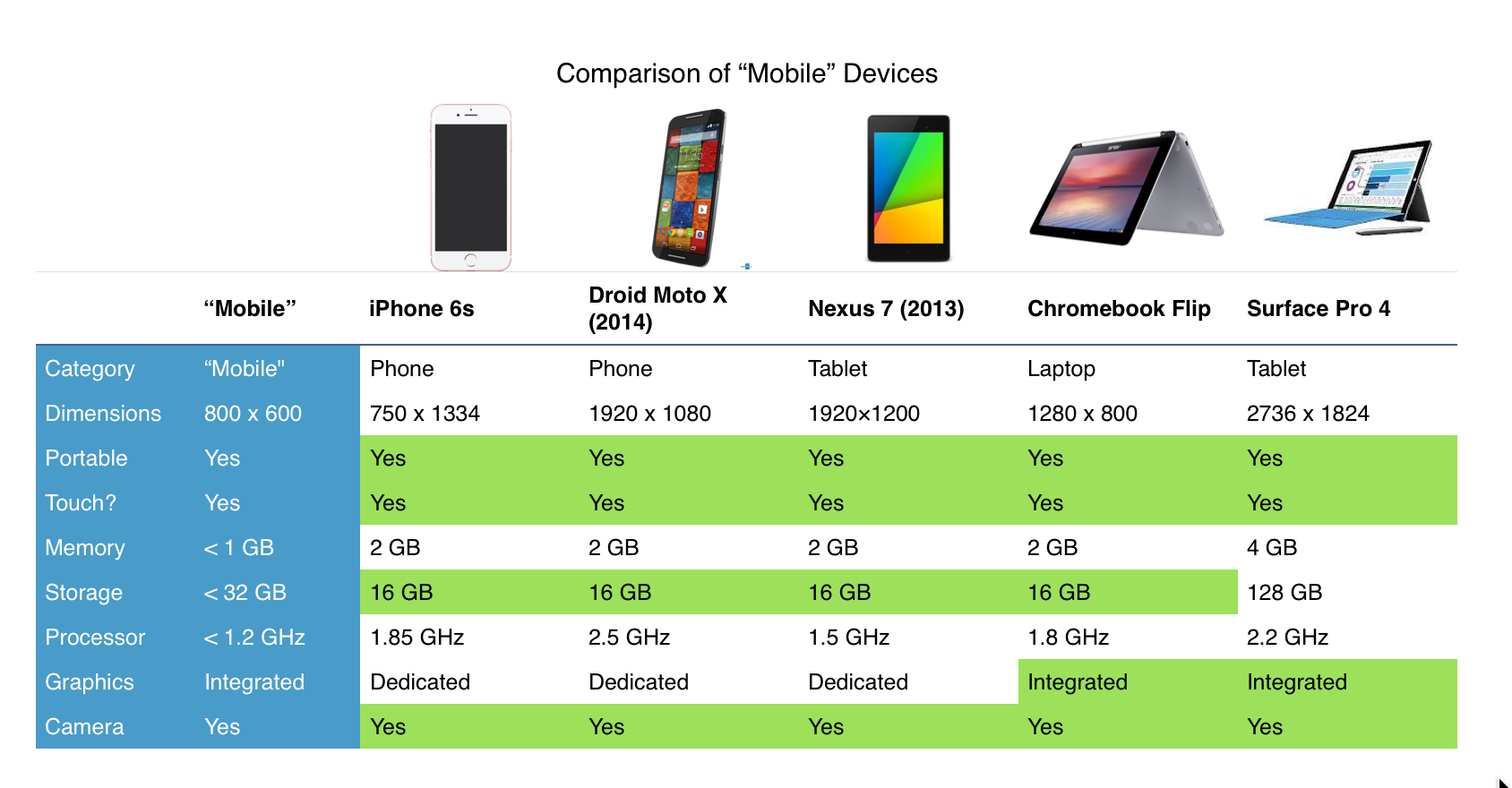
The one most closely resembling a "mobile" or "low powered portable device with small touch screen" is, surprisingly, the only bonafide laptop in the mix. The Chromebook Flip. Everything else is pretty equally matched. Granted, these devices have been cherry-picked to highlight my point, it still stands that these are popular devices and this sort of trend is only going to become increasingly prevalent.
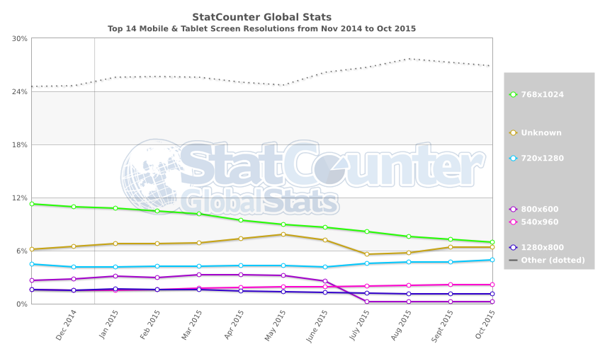
Let's dig a little deeper into this. What are the actual statistics?
According to StatCounter: Of the 14 most popular screen resolutions, over 14% of all non-desktop devices were in the desktop size range. That figure is only increasing.
An Emerging Trend
A few years ago there was significant overhead when you wanted to add your software to a particular platform. You had to write something separate for Windows, Mac, iPhone, iPad, Windows Phone, Android, and so on.
That distinction has largely disappeared now. Not only do iOS and Windows both support "Universal Apps" which more or less work on all the devices their operating system runs on with minimal additional work, but there are numerous ways (particularly JavaScript) that allow developers to develop a single application for most platforms.
We're moving away from the idea of "mobile", or "phone" or "tablet" and towards the much better notion of: Adaptive. Of all technology and gateways out there, the web has been a shining example of adaptive software.
You can download your favorite browser on nearly every device that you use and get a familiar but adaptive experience no matter where you summon a particular web app or site.
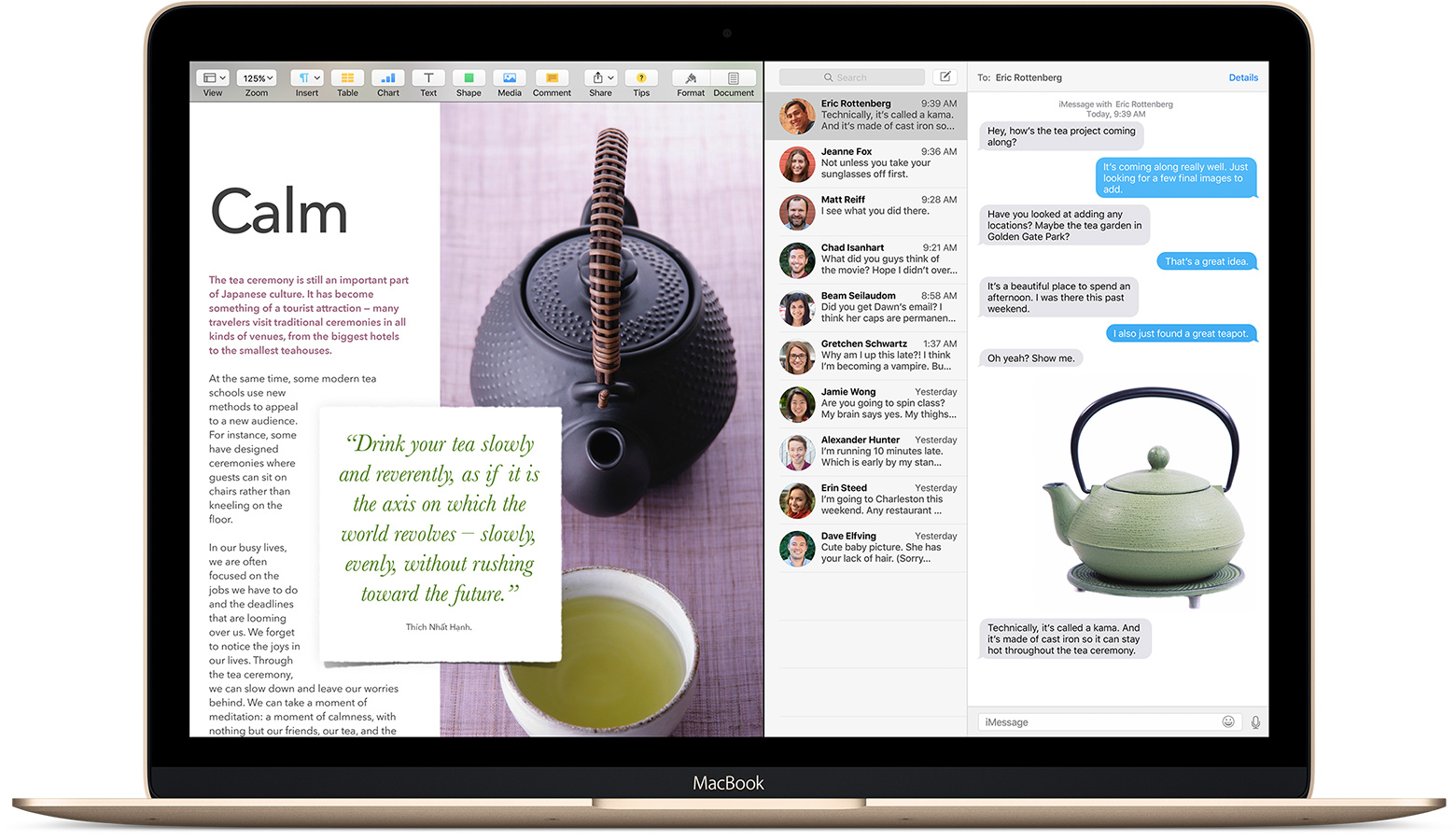
Adaptive software not only adapts to the device it is being used on, but even how it is being used within that device. Consider the following feature present in Windows 10, iOS 9, and Mac OS X Mavericks: Split Screen.
I have been splitting up my desktop between multiple windows/apps for most of my life; and I know I'm not alone in this behavior. This bears far greater significance than just the mere acknowledgement of usage trends. It serves as a sort of final step in accepting adaptable software.
It is no longer useful to design exclusively for a particular form factor. Of course we should pay attention to critical markers on the size and functionality spectrum, but what is most critical is to no longer view software as a singular sort of layout.
Adaptive Software
Looking at software as adaptive is a very different way of thinking about it, though its a mindset that has started to come about in recent years.
There are some caveats with this, though. Not all software, and not every feature of all software, is relevant on every platform or form-factor. Making software adaptive doesn't always mean you should stretch-and-squeeze it onto everything. For example, full-fledged Photoshop should never, ever be on a smartwatch. Not only are there some serious technical constraints in doing this, but even if you managed to achieve it, its simply not the purpose of, or very useful on, a smartwatch.
Some important guidelines to keep in mind:
Size should be fluid
One of the most important principles of adaptive software is that size should always be as fluid as is reasonably possible and useful. There may be some hard limits on how big or small your particular software can be and still be useful, but within that spectrum, you should avoid anchoring your designs in assumptions about height, width, or even overall device size.
Go Beyond Stretch-and-Squeeze
The easiest approach to building adaptive software is to design it in such a way that it is easy to stretch-and-squeeze. This was one of the reasons that Mobile-First was such a popular approach. If you build for the smallest size first, then you can simply stretch your app for larger devices. Stretching out is way easier than squeezing down because when you squeeze down you have to remove things and refactor them.
Even though there is a good deal of stretch-and-squeeze that will occur in almost any design, you should avoid it where you can
Utilize Platform Differences
It can be tempting, and perhaps even natural, to interpret the idea of adaptive software as a call to build your software for the lowest-common denominator. The allure of this approach is minimizing the amount of work because you minimize extra accommodations for differences in platforms.
But adaptive software isn't "everywhere software". Its software which adapts to whatever context its put into. So if TouchID makes sense for your software on the iPhone, go ahead and add the functionality, even if you won't be adding it anywhere else.
This is important because, beyond just adhering to the definition of adaptive, there is a lot of value in respecting and utilizing these differences. Platforms differ for a myriad of reasons, but some of these differences are not merely incidental; they are often useful and the platform is differentiated by these characteristics because users want them. Their workflow and use of that platform can often be based on these differences.
Conclusion
Mobile-First was a great evolution for software design. We learned to prioritize and optimize our software, and broke away from the all-you-can-eat mentality of desktop software.
But the right mindset is not mobile-first, or desktop-first. We have to create adaptive software.